Find out · · 10 min read
What Sansa Taught Me: Designing a Web Space for Quiet Company
In this post
- A question that led from Sansa to the beach
- The temple setting suggests the first action
- Start by separating movement from camera controls
- Bowing needs a way to stop as much as a way to start
- Prayer beads narrow the focus without erasing the setting
- Wordless actions can still be directed toward others
- Buttons and scenery form the same experience
- Small actions still require practical work behind the scenes
- Beach answers the same question with different actions
A question that led from Sansa to the beach
When building a place on the web, it is natural to think first about how it looks. Add buildings and trees, set up the lighting, and let a character walk around. But questions remain even after the scenery is complete. What should visitors do there? How should they respond when they meet someone else? Is there a reason to stay even when they stop interacting?
Sansa is an online temple that offers a useful way to explore these questions. Its official introduction reads, in translation, “Sansa, an online temple where we sit together without words.” A single sentence describes the place, the activity, and the relationship with other people. It introduces a way of being there before listing things to accomplish.
Sansa also inspired Kortress Beach, which I made. A beach needed activities that belonged on a beach, though. I used my own character, Korsh, and built the space around lighting fireworks, sitting together, and walking together. This article first looks at Sansa's interface and the way its actions are organized. I cover Beach's actual code and revisions in a separate making-of article.
Sansa is another creator's service. The three images here are desktop screenshots captured during an actual visit while preparing this article. I distinguish between controls observed on screen, explanations the creator gave in interviews, and my interpretation as a maker. The features described reflect the interface checked in November 2026.
The temple setting suggests the first action
Sansa was created by Park Jin-won. In an interview with Yonhap News, he explained that he built the online space because he wanted a short rest at a real temple but lacked the time and energy to go. The interview also describes his use of AI to help implement it. Yonhap News interview with the creator
That background connects to the composition of the screen. A path leads toward the temple hall, with Buddha statues and cushions visible inside. The character faces in that direction. Along the bottom are actions for joining hands in prayer, bowing, playing a wooden temple percussion instrument, and using prayer beads. Even before reading a long explanation, visitors can begin to infer both the purpose of the space and what they can do there.
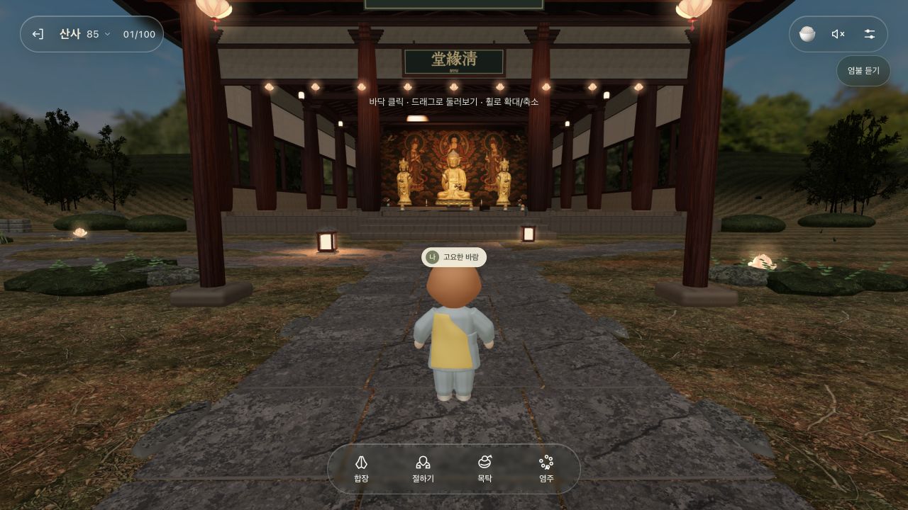
The entrance to the temple hall, captured during an actual visit in November 2026. The control instructions in the center and the action menu at the bottom are visible together.
The architectural realism is only part of what matters here. The central Buddha statue, the places arranged in front of it, and the path leading there all point in the same direction. The space itself tells visitors where to look. When paths and layout share the work of guiding people, on-screen explanations have less to carry on their own.
A temple setting is not equally familiar to everyone, of course. Some visitors may not know prayer gestures or prayer beads. That makes the short menu labels important. They offer predictable actions to people familiar with the setting and specific items to try for newcomers. The interface goes a step beyond simply presenting an atmospheric scene.
Start by separating movement from camera controls
The desktop screenshot shows the instruction “Click the ground · Drag to look around · Scroll to zoom.” On a first visit to Sansa, it helps to try these three controls separately: click the ground where you want to go, drag the screen to look around, and use the scroll wheel to adjust the viewing distance.
Movement and camera rotation can be easy to confuse in a 3D scene. At first, it may be hard to tell whether the character is walking or only the viewpoint is changing. Sansa breaks the inputs down into short instructions. The control descriptions in this article are for desktop; I did not separately check phone controls or performance.
Next, you can try the actions in the bottom menu one at a time. Rather than pressing several items immediately, it is easier to understand the interface by stopping movement and observing what changes after one action. Bowing and prayer beads are particularly useful for comparing how the screen changes after a selection.
The upper-right corner contains sound and settings icons, along with a “Listen to chanting” label. The speaker in the captured screen shows a muted state. Even in a space where sound matters, visitors need to be able to see its current state. Sound controls occupy a different part of the screen from the action menu.
This arrangement is worth considering when building a space. Movement, the current action, and sound and settings serve different purposes and are used at different frequencies. Giving them distinct places, instead of arranging everything as equally sized buttons, makes it easier for visitors to decide what to find first.
Bowing needs a way to stop as much as a way to start
After selecting bowing in the bottom menu, that item changes to “Stop.” An instruction above says, “You can look around while you wait, or stop.” The screen shows both the ongoing action and the way to end it.
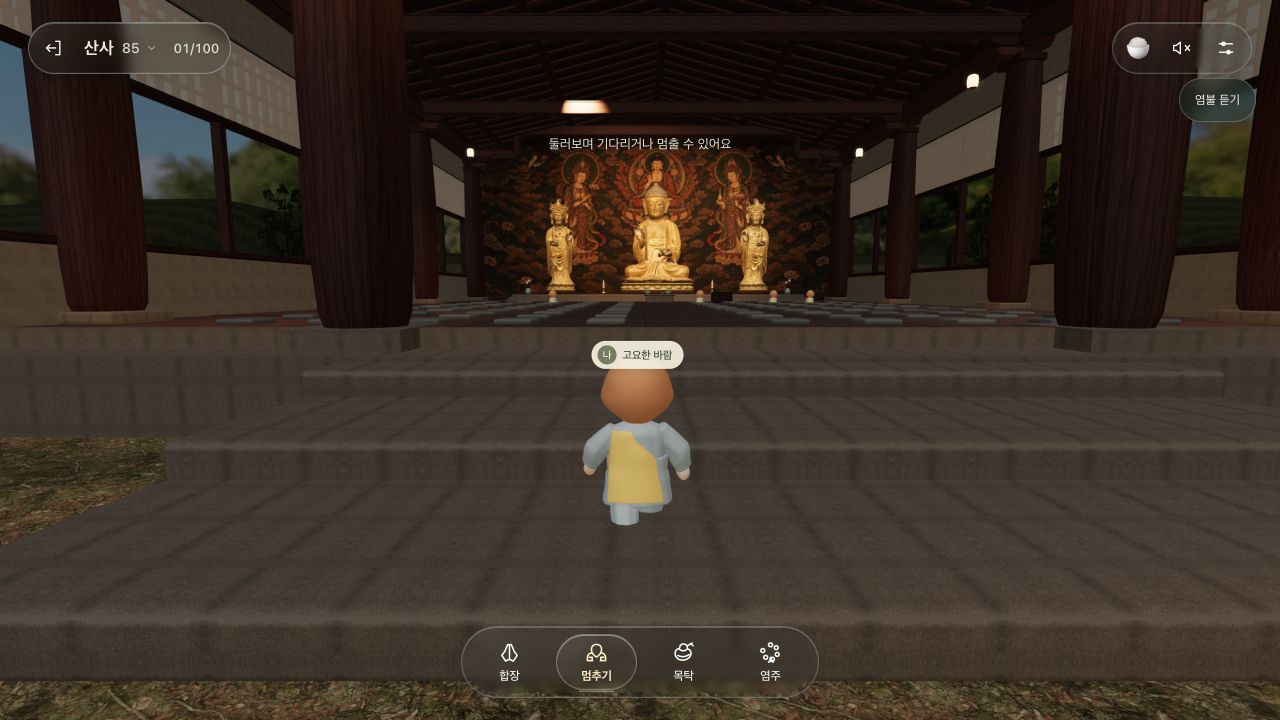
A screenshot captured with bowing active. “Stop” at the bottom and the instruction above communicate the current state.
A repeating action requires more than a start button. Visitors need to know whether it is running, how long they should wait, whether they can look elsewhere, and whether they can stop whenever they want. Small changes like these matter even more in a quiet interface. Without a large notification, a button label does the work of explaining the state.
From a maker's perspective, this is a different kind of polish from animation quality. Even a convincing bow can feel frustrating if the user cannot find a way to stop. When the current state and the exit are visible, visitors have room to watch the repeated movement or change their viewpoint. Creating movement and giving people control over that movement need to be designed together.
This principle extends beyond religious gestures. The same questions apply to activities that continue for a while, such as sitting together, dancing, or fishing. Does the button label change after it is pressed? Can the user leave halfway through? Do the normal controls return when the action ends? These transitions deserve concrete attention when building a space.
Prayer beads narrow the focus without erasing the setting
Selecting prayer beads brings a large set of beads into the center of the screen while the temple hall behind them becomes blurred. The captured screen shows “0 / 108,” “First round,” and “Grab and swipe through.” A “Collapse” control appears below. The object to touch, the required input, and the way to close it are gathered in one view.
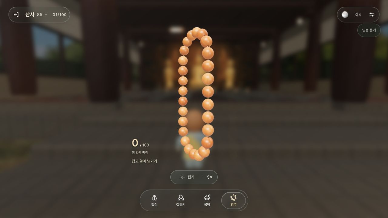
The initial count of 0, immediately after opening the prayer beads. This capture did not check what happens after completing 108 repetitions.
A small 3D object left far away can be difficult to manipulate because the place to grab is unclear. This screen enlarges the beads and explains the hand motion in words. Blurring the background draws attention to the center while preserving the colors and shapes of the hall. It reads as concentrating on one action within the same space, rather than moving somewhere else.
Comparing prayer beads with bowing also shows that different actions need different views. For bowing, the relationship between the character and the hall remains important. For prayer beads, the object being handled needs to be large enough. Even when both begin in the same bottom menu, the visual priorities afterward differ. The size and distance suit the action instead of forcing every feature into a single screen format.
The number on screen gives a unit to the repetition. Even when an action stays the same, knowing which repetition you are on helps you keep track of progress. Enlarging the beads and displaying the count work together in this interface.
Wordless actions can still be directed toward others
Describing Sansa only by its lack of chat misses something important. Even in a space with fewer words, visitors need things they can do. Small actions that belong in this setting, such as prayer gestures, bowing, and prayer beads, occupy the center of the interface. Looking at what takes the place of a conversation window reveals the character of the space.
In a phone interview with MBN, creator Park Jin-won explained that he had not built a separate chat feature and described the experience of not feeling alone even without speaking as one of the space's characteristics. MBN interview with the creator
Read through the lens of interaction design, this raises a question: how much can a space reduce the burden of explaining yourself to others? In chat, you compose a sentence, send it, and wait for a reply. An action with a relatively established meaning, such as joining hands in prayer, narrows the choices. It offers a greeting without necessarily starting a long conversation.
The meaning of an action will not automatically reach every visitor, however. Even a simple gesture can feel awkward if people cannot tell whether the other person sees it or cannot recognize a response. That makes cues such as character orientation, the start and end of an action, and the distance between people especially important in a wordless space. Fewer words do not mean less information to design.
Buttons and scenery form the same experience
Looking only at models and lighting leaves something out when assessing a 3D space. The bottom menu, settings in the corner, and instruction text are also part of the scenery visitors keep looking at. Even when buildings and characters establish one mood, buttons that follow a different visual language can repeatedly interrupt attention.
In the captured Sansa screen, the action menu sits inside a rounded translucent area, and each item has an icon and a short label. The hall remains widely visible while the controls are easy to locate below. Rather than examining each button's decoration on its own, it is useful to ask whether text stays readable against a busy background and whether the selected item is distinguishable.
Buttons also explain the results of actions: “Bow” becomes “Stop,” and selecting prayer beads changes that item's state. Refining the design therefore goes beyond choosing colors and corner radii. It includes checking whether the screen after a press matches the expectation before it, and whether similar actions are represented consistently.
This perspective carries over to refining my site and Beach. Adding detail to scenery and organizing type and buttons improve different aspects of the experience. Even a camera angle that shows the character well can be difficult to use if a menu covers the hands or face. Choosing an attractive screenshot and creating a view suited to actual interaction need to be considered together.
Small actions still require practical work behind the scenes
The number of features a visitor sees is not the same as the number of things a creator has to manage. Even a screen with only a few buttons can involve waiting to connect, canceling an action, or finding that sound will not play. Before expanding every feature, it matters to check that the basic actions hold together.
In an interview with JoongAng Ilbo, Sansa's creator described prioritizing server stability and polishing basic features such as chanting and 108 bows. He also discussed using AI to write code while handling planning and communication himself. His explanation emphasized continuing to improve the basic experience after release. JoongAng Ilbo Factpl interview with the creator
The visitor figures and development times in those reports describe their particular moment, so I have not compared them here as current results. What is worth examining in Sansa is the set of concrete choices visible on screen. An action that communicates briefly, a button that reports its running state, and a view that enlarges the object being handled can all inform the making of other places.
Beach answers the same question with different actions
What inspired me in Sansa was the possibility of making an online space where people could spend time together. For Beach, I used my mascot Korsh. The setting became a beach, and the activities became lighting fireworks, writing with light, sitting side by side, and walking hand in hand. The question of expressing a place's character through its actions took a different form.
The useful comparison is what feels like a natural action in each space. Just as prayer gestures and beads help explain the temple, the beach, fireworks, and interactions between characters do that work in Beach. Changing the background and renaming menu items is not enough. The position of a handheld tool, the distance from another person, and the controls on screen also need to fit the place.
With Beach, I can go further into the process of connecting these actions and revising them: why the ground looked wet before the wave arrived, what had to be prepared before two characters could sit together, and which code changed to make those things work.
The Kortress Beach making-of article shows those differences through actual screenshots and development footage. In Sansa, I have examined how small actions give a space its character. In Beach, I explain how I worked to connect those actions across code, characters, and another visitor's screen.