Most people open trend charts and still feel unsure what to do next.
The usual reason is chart-reading style: scoring daily wins and losses instead of reading decision direction.
A useful graph review should answer one question: what single adjustment should I make next week?
First check: data quality before interpretation
Before reading trend slope, check:
- capture consistency (time, environment)
- gap frequency in logs
- outlier density
- multi-metric alignment
If data quality is unstable, strategy edits will likely be noisy too.
Read different windows for different questions
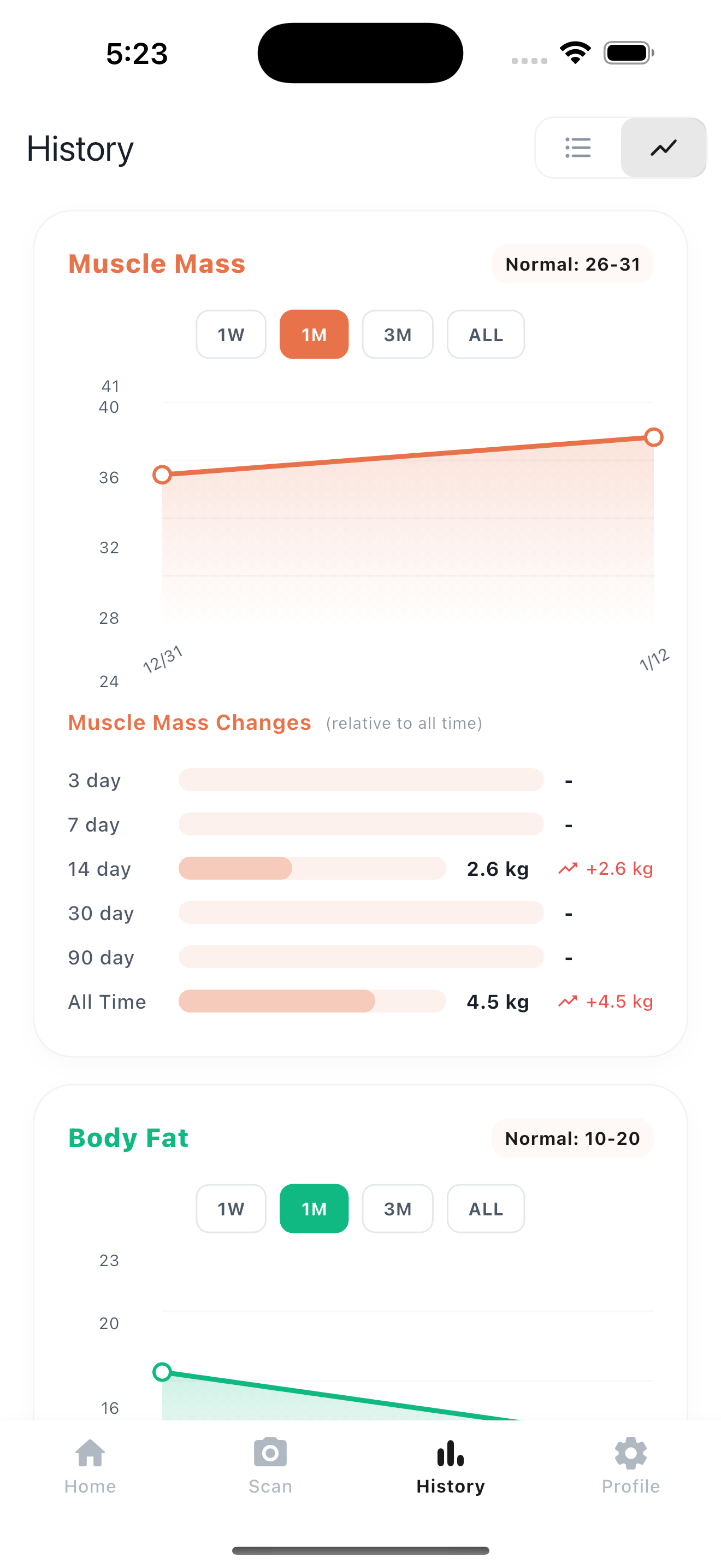
1W: where execution broke this week1M: whether strategy direction is workingALL: recurring behavioral pattern
Most operational decisions should be based on 1M direction, not 1W emotion.
 Graphs are operational maps, not daily scoreboards.
Pattern interpretation examples
- weight flat + body fat down + muscle stable -> continue
- weight down fast + muscle down -> reduce aggression
- weight up + body fat up + muscle flat -> fix nutrition/activity adherence
- high volatility across all metrics -> improve logging consistency first
A 10-minute weekly review template
- one-line summary of this week
- one likely cause of instability
- one habit to keep
- one variable to adjust
If review does not produce one clear action, it is not complete.
Common graph mistakes
- zooming into one data point
- reading scale line alone
- changing multiple variables at once
- abandoning logs after a gap
Graph literacy is mostly about controlled sequencing.
Bottom line
History graphs become powerful when you shift from daily judgment to monthly direction.
Use them to run an iterative loop: capture, interpret, adjust, repeat.
- Product page: Kodebody
- Related read: Weight-Loss Plateau Checklist
- Related read: Body Fat and Muscle Tracking Strategy
- Related read: 15-Minute Weekend Check-In Routine